3 Copy Mistakes SaaS Founders Should Stop Making
Lianna here. Allow me to step on my tiny soapbox for a second: 📦
I've written website copy for more SaaS businesses than I can count. (I mean, I could count them, but I have better ways to spend the next hour. Like writing to you.)
I see the same copy faux pas nearly every time I dive into a new site. These mistakes span revenue ranges and stages of sophistication, from brand-new baby SaaS to "so big and successful, seeing this here is kind of embarrassing."
What are these mistakes?Mistake #1: Homepage headlines that fail to address the Big 3.
The Big 3 meaning: What you do, Who you do it for, and Why they should care.
Are there other great ways to write your homepage headline? Absolutely. But if you've never tried this formula, you're probably overlooking something critical.
Here's a real-life headline that doesn't address the Big 3 (I won't tell you where I found it).
Below it you’ll find my 10-second rewrite of the same headline. Which is clearer?
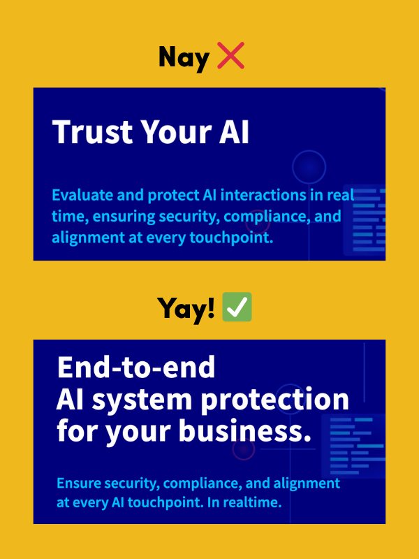
Longer, yes. But much clearer. I also chopped up the subheadline because that first one has way too much info to keep in your head all at once!
Mistake #2: Vague, toothless calls to action.
Call-to-action copy should, you know, call people to action.
"Learn more"? I have never in my life wanted to learn more. I have learned enough.
"Sign up"? Sign up for what? What happens after??? I HAVE ANXIETY AND I NEED TO KNOW.
Look, "sign up" is the frozen yogurt of CTAs. It's fine, but we'd all much rather have double fudge ice cream.
Even "Start Free Trial" can be improved. How long is the trial? Do I get access to all the features? Wouldn't it be more enticing to claim my free trial? And even more enticing to "Claim my 14-day free trial"?
Bonus mistake 2.5:
CTAs that make it seem like it'll take an *enormous* amount of effort for your visitor to get what they want.
"Contact sales" just makes me dread the amount of back-and-forth I'm going to have to do to get an actual price. As for "Request a demo" <-- Why would you put so many blocks between you and your potential customers, unless you're intentionally trying to disqualify non-enterprise buyers?
IMO, you're allowed to add that much friction when you reach $10M ARR, and not a cent before.
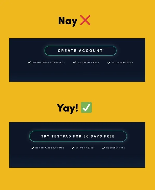
Create Account gets blown out of the water by Try Testpad for 30 Days Free, right? (I'll be honest: I wrote this page, which is why it says "No Shenanigans".)
And finally,
Mistake #3: Crowded screenshots that show everything and nothing.
There's a delicate balance between never showing your tool at all (tee hee), and showing too much. The key with product screenshots is to explicitly draw the eye to whatever feature the copy is currently talking about.
Circle it, highlight it, add an arrow, whatever you need to do. Even add a caption that explains exactly what the user is looking at (and how it helps them in a meaningful way).
What's that, dear reader? Why am I talking about images in an email about copy?
Because design needs to support copy. Even the most brilliant, user-focused, conversion-forward copy can get taken down by drab design — and even the dullest copy can be elevated by excellent design.
Start with copy, and go from there.
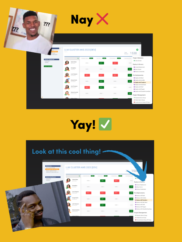
Product screenshots should show just what you need to see to understand the tool (or the part of the tool the copy is currently addressing).
And now back to you.
Go ahead, open your website. See if you’re making any of these mistakes. And if you are… now’s the time to adjust!